Saturday, June 29, 2013

Once upon a time in Texas – Turn paper into Galvanised Steel with Distress Paint!

DSC00326 I accidentally discovered a pretty neat painting technique while messing around with Distress Paint.  It is so super cool that I can barely wait to show it to you. 

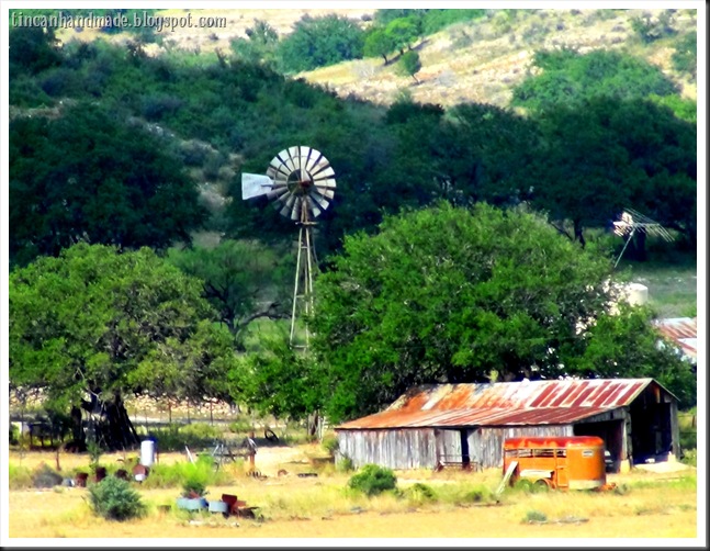
I have the good fortune of being loved and spoiled by a dear sweet lady who owns a few ranches in Central Texas.  Last year around this time of year, her son took me out for  a fantastic “off-road” trip all over one of their ranches.  It was there that I took this picture on the left.   There are so many good memories and feelings attached to this day that whenever I look at this picture it almost feels that I am drawn back to the delirium of that time – albeit now - a little more wistfully.

So since I am in a bit of a melancholic reverie - I have decided that I am going to create something inspired by this picture to demonstrate the process of creating a Galvanised steel effect on paper.  TH0621023 219
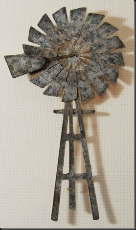
The element that I am going to be galvanising is that awesomely gnarly windmill.   

I drew/created/ made the windmill shape in MAKE THE CUT. I am going to also turn the old rickety barn and horse trailer into a “stamp” by tweaking it in GIMP. This is purely so that I have an excuse to do more Distress Marker-watercoloring. 


I am also going to show with you my cool new tool that I call the Tincan tool.  I am so convinced that it is the next best tool for everything that involves nickity pickety work that I am patenting it.

To create the galvanised steel paint effect:
You’re going to need Distress Paint in Black Soot, White Picket Fence, Weathered Wood and Brushed Pewter. 
  
You are also going to need some kind of applicator that makes a rectangular or square pattern because galvanised steel has a little bit of a cross hatched look as opposed to brushed metal or chrome metal. 

As you will  see in the video tut below– I also used the “Tincan tool”, which I will show you how to make and threaded on 2 foam squares – but you could just as easily punch out foam squares with a square punch or even just cut itsy bitsy teensy ones with a scissors….or a bush knife if you’re hard core like that.

 Here is a handy 3 and a half minute video demonstrating the process.

and a few pictures of the final project in the making –
TH0621023 184
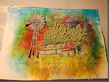
I designed and cut out a windmill shape  on MTC -  see on the top right of this post for the finished galvanised windmill.


I manipulated the original photo (pictured at the top of this post) in GIMP and turned it into a stamp or colouring book type image (right).  I prefer to manually “create” the stamp in GIMP because I can manipulate the adjustments wherever and however I want it to be – for instance I want some areas less speckly and other areas sharper.  So GIMP is the best fit for me for this control-freaky reason.  However to get to a point where you can start tweaking like this is a bit of a learning curve, so if you want to skip all the frustrating figuring out - try Photoshop beause it has an automatic stamp filter, the old Windows 95 Picture editor(downloadable now as a stand-alone programme) can turn an image into a stamp.

laura's barn colouring


There is a free programme called Irfan View that also has a filter that will turn an image into a stamp.  The con is that you get an automatically rendered stamp filter that is not as “malleable’ as when you do it manually – layer by layer, pixel by pixel.  

I used Distress Markers to colour and blend in the image to make it look somewhat like a comic book image.  I used Distress Ink on the back ground and painted clouds etc with a waterbrush, that is what gives it that batik type of effect.
TH0621023 221TH0621023 237 

I filled in the trees freehand with my favourite type of textural paint.  It is product called Puff Paint by Dala (I have blogged about this before over here 
DALA PUFF PAINT )*edited to add - Dala Puff Paint is like Marvy Uchida's Liquid Applique, but cheaper, more value for buck and faster working - with a hairdryer I can get it puffing in a matter of minutes whereas with Liquid Applique - you have to let it set for a couple of hours. 
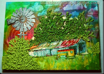
TH0621023 254I decided to turn this little piece of stamped colouring book art into a Gratitude Journal for the lady I talked about above.  I thought it would be fitting because she told me that she loved this ranch and she is such a dear soul, so full of love, positivity and she notices beautiful things and beautiful words and phrases.  So I knew if anyone would keep a Gratitude Journal – it would be her.  I wound up making two versions of the journal – because I messed up the first one (here on the right)  by glueing it down all crooked and I also felt like the perspective was off in terms of the overly large windmill.  I am so anal about stuff like that, that I couldn’t bring myself to be happy with that.

So I made a new book, re-coloured the barn etc and recut the windmill in a smaller scale.  This meant that I lost some of the cool detail because my cutter cant handle tiny cuts that well, but it was good enough.  I embossed the barn and trailer part of the image with a generous layer of UTEE.  I then used an old handwritten text stamp from a Chiswick line  to balance out the stark contrast of the focal elements of the image by kinda watermark stamping.  I added a little “label” particular to the receiver of the gift.  I was now super happy with the final project.  TH0621023 256
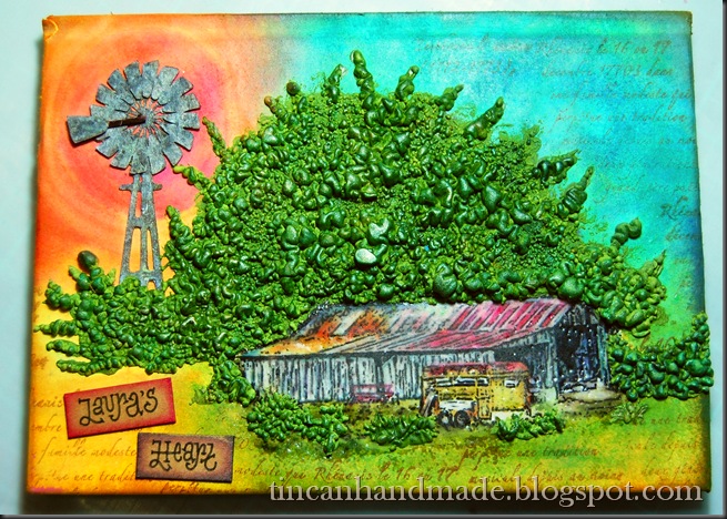
 What do you think bloggin’ buddies?  Does it work for you?  I’d love to see all the cool stuff that you create using this technique please send me a link if you do upload a project and I will add the link to this post.  Stay tuned for the next installment of Distress Paint Metal FX!!!
DISTRESS Paint was conceptualised by the amazingly talented Graphic designer Tim Holtz.  Click here-->  TIM HOLTZ DISTRESS PAINT to go to the product info which also contains a swatch of all the colours in the range - Click here-->  TIM HOLTZ DISTRESS PAINT VIDEO DEMO to link to Tim Holtz demonstrating the basic qualites of Distress Paint.  I am not paid or sponsored by Tim Holtz or Ranger – I just really love these products.


Thursday, June 20, 2013

What else you can do with Distress Paint? - “I’ve got the moves like Jagger”!

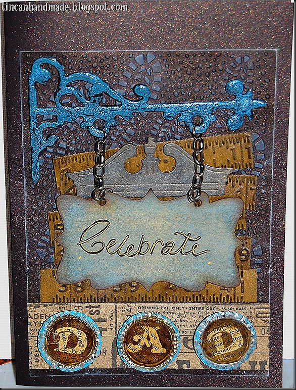
TH0621023 075 This is the card I created for Father’s Day for my dad this year.  I have blogged on other posts here about how much I love this Distress paint.  While making this card I discovered another cool effect you can get with it. 
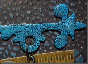
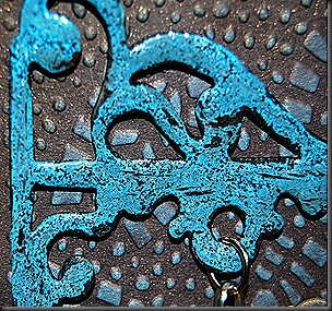
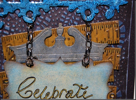
I cut out the hanging sign post from the Tim Holtz ALTERATIONS DIE – Hanging Sign.  Look at that weathered paint look on the post – isn’t that just yummilicious?  I discovered that by accident.  I had originally inked the post in Black soot Distress Ink and then covered it in UTEE.  I heated it til it got all melty but still bumpy.  This was the look I was going for, but when I placed it on that lovely dark chocolatey sparkly Cardstock – it was getting lost – I needed more contrast. 
TH0621023 082
The only thing that I could think of that would pop on top of black was the Distress Paint because they are so wonderfully opaque.  So I busted out the Salty Ocean Distress Paint and painted on top that.  Then I sprinkled UTEE on top of that and heated it.  This time I heated it until it was almost boiling.  When it cooled down I was left with that awesome weathered paint effect.  Isn’t that so stinkin’ cool?
I like the way the paint pulled away from the edges as well - I think it lends to authenticity – can you imagine it hanging above the entrance to an old pub?

TH0621023 080Now see the little embossed bootprints on the background mat?  I swiped some Distress Paint in Salty Ocean and then a teeny bit of Picket Fence on my “lino-sheet palette”, and then misted it with water. I then took a make-up sponge and dabbed in it a bit.  I let the sponge sit for while so that it dried out a bit.  Once I was satisfied with the dryness-factor – I gently buffed over the bootprints and rocks. I swear it works like chalk ink.  Distress Paint – dannnnnnnng! (The bootprint folder is from the Spellbinders Embossabilites line).  I used the same make-up sponge dabbled in watered down Distress Paint to ink up the sign. 

TH0621023 077


 The rulers behind the sign were inspired by this fabulous design by Shelly Hickox featured in  the Sizzix blog - you can find it here in this post - Shelly Hickox Ruler box frame 


     The Pediment(behind the sign)comes from the Alterations Pediments Set and was cut out of Grunge Paper.  I sorta mottled on Vintage Photo DP and over that I dabbed on a generous amount of brushed pewter DP.
You know from my last post that I recently salvaged a bunch of bottlecaps from a local pub and have been playing all sorts of mean tricks on them.

TH0621023 085
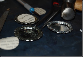
For this act of trickery - I cut out circles from an old book page and then stamped in Ranger’s Watermark Resist ink, I then put Embossing Powder all over that and embossed. I then went over with Gathered Twigs Distress Ink.  Those went in the bottlecaps and I used Kraftex Pratligo Resin to fill it.  I like this whole resin thing,it is way too satisfying for it to be legal.


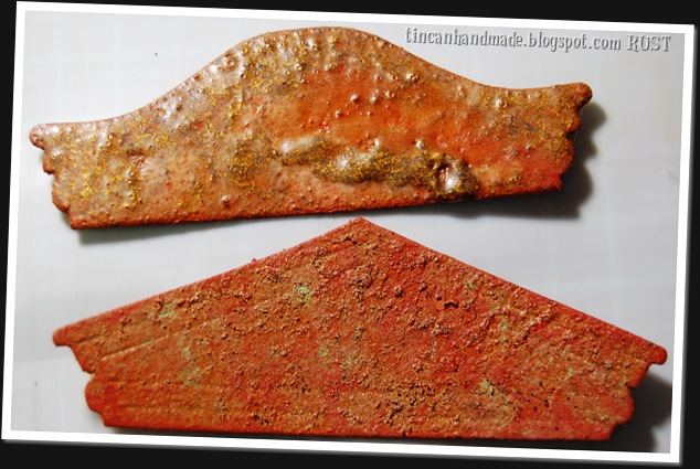
I could’nt wait to try the weathered paint effect with the orange and yellow hues in the Distress Paint line.  I had a suspicion that it would give me the best faux-rusty effect yet, and I am so all about rust, metal and tin right now.  I suspect I really would rename myself Tincan if I didn't have to wait in the long, long queues at Home Affairs to pick up a form to do so. Anyway – I got to messing around some more with it and I have discovered that Distress Paint is about as perfect a paint can get to create certain gnarly, sweet@ss metal effects.
 
I am going to be posting tutorials on how I created each effect, not in this post though because it would take me all night to do so – BUT STAY TUNED because it is so easy and totally rad looking.  So as a teaser for my upcoming blog posts, lemme get down on it and show you what you can do with Distress Paint other than all the cool blendy stuff.

TH0621023 123


I am not even done talking – if you stay tuned for these tutorials – I am going to share with you a new, brilliant crafty tool I inadvertently “invented” that is super easy to make and unbelievably versatile to use for almost anything that requires fine detailing.  I’m loving it like an Oreo McFlurry!

That’s all for now – I hope it whets your appetite.


Friday, June 14, 2013

12 TAGS OF 2013 – June Edition

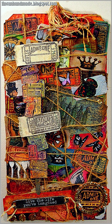
TH0621023 main image Wow, it took me just about forever to decide on what I was going to do for this month’s Tim Holtz 12 Tags challenge.  The odd thing is that this time around I really had everything that was needed for the tag which quite wonderfully consisted of Distress Markers, Tag stock and little Stampology.  I think that this might have been the problem for me.  You see I rarely have all the supplies on hand and I usually have to find some creative solution to compensate for the lack thereof.  This time I had EVERYTHING which may have translated into mega-epic-proportion stamper block! 
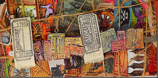
Eventually though, fate cut me a break. Scrapworx in Richards Bay got a horde of cool new dies, and I bought the mini filmstrip and ticket die.  I was really keen on trying that out. I cut the tickets out and loved them, I mean – who doesn’t right?  Well now that I have them blank tickets – what should I do with them….hmmmm they look about the same size as the mini-tickets from the stampology Visual artistry sets.  Well what do you know – they are!  I played around with that for a while meaning that I stamped the ticket stamp in every Archival colour that I own, and then I got bored.  So then I thought – let me stamp some images on them and see how that works out.  I liked it but it was too 1820’s schoolbook looking, so I decided to liven up the monochrome with Distress Markers.  TIGERBLOOD WIN!!!!  I had so much fun, I distress markered like Charlie Sheen’s sobriety depended on it.
In the middle of that particular brand of mayhem I had a moment of epiphanic genius.  All the June Challenge calls for is distress markering a stamped image and then layering that on a distress painted tag. TIGERBLOOD WIN #2 – I could totally stick all my coloured tickets on a tag – and solve the stamper’s block dilemma!  And that folks, is the way the cookie crumbled.
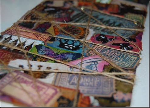
Now, if you are familiar with my style at all, you know that I cant handle non-texture. I didn’t love just the pasted tickets even though they were pretty cool to do and they had a little something-something going on texture wise. 
But it really wasn’t hitting the spot for me so then I wrapped hessian/burlap string all around the tag.
TH0621023 041 
I still thought that it needed something else.  I used some Barn door and Wild honey distress paint and added a few here-and-there swipes of rusty hinge ink with and an over-wash of the coppery distress stain to a bunch of tickets.  Then I dipped my brush in some Perfect Pearls to nail that rusty look down.
TH0621023 063 
Oh yeah – I also painted on some Fired Earth Rust Medium for the gritty rust- but apart from providing the grit – it didn't really work out so well.  So my recommendation is to forego the Fried Earth brand of Rust agent if you are hoping that it will give you a rust effect.  You could just as easily buy sand and add it to paint and get the same effect.  I am nursing serious buyers remorse abut that (particularly since it was about R200-00 ($20).I stuck on a word band on that and threaded some hessian string through that.  Still not feeling the love though.
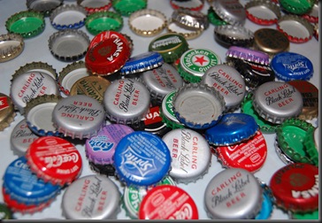
The other day I salvaged a bunch of bottle caps that would’ve ended up as garbageTH0621023 006 otherwise. TH0621023 001
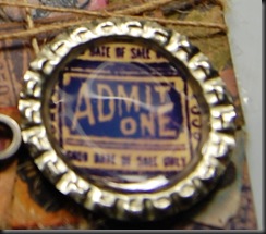
The rescued the bottle caps got flattened with my pliers.  I stamped one of the ADMIT ONE ticket stamps as the focal image and glossy accented over it. 
TH0621023 059This seemed to pull the things together a little more.
(EEKS about the reflection of the lamp there)
At this point, I was almost happy and Charlie Sheen was a few steps away from being okay.
Next I stamped on the wrong side of Calico Fabric that I pre-starched – LOOOOVVVVVVEDD how this turned out and I think I am going to love the Eclectic Elements Fabric when it arrives in South Africa.  I also stamped the teeny collection of mini- tickets from one of the acrylic clear Visual Artistry Stamp sets. TH0621023 070 I distress markered those as well and glossy accented (as if you didn’t know that I was going to that).  I cut that in half abouts – and alternated the fabric tags with the paper ones and stuck them on a popsicle stick painted with Brushed pewter Distress Paint.
I am now happy with what I am going to enter – and Charlie is on his way to being relatively sober!!!


Friday, June 7, 2013

Cross-pollinating here but too excited not to share....

I maintain 3 separate blogs (my blog for my students is specific to the course that I am responsible for at my day job), the other blog is also related to my job but it is more a labour of love type effort that is merely related to my day job.  And then there is this one (which is really my favourite blog because it all belongs to me and my fits of whimsy and really is not related to anything else but whatever I feel like putting or doing on it.  I initiated a Craft Club project last year at my day job and I was thrilled to hear yesterday that the letter I wrote to a national magazine was published as its winning letter for the June edition of IDEAS magazine in South Africa.  I really do love this magazine and I think I have sort of got my students hooked on it too and so I wrote in to tell them about how cute it all is.  Anyway - they published it!!!  Yeay for us!  Now I know that this blog is separate to the Craft Club Blog - but I am so excited that we got some publicity in a nation-wide publication (June 2013 IDEAS magazine) I want to share it on this blog as well.